UX Case study: Blooms Bouquet Shop


A mobile app and a responsive website designed to make it easier for users to quickly preview and purchase bouquets of flowers.
This case study for my Google UX Design Professional Certificate features creating a flower online store that allows the users to have an enjoyable experience to shop for flowers making the process intuitive, simple and fast.

Project overview
The Product
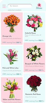
Blooms is a bouquet ordering app and website which is an effective way to buy flowers for their loved ones. Our goal is to make the ordering process easy and quick. Blooms ships the flowers nationwide, as well as has stores in 24 cities in the countries where the store pick-up option is available.
The Problem
Buying a bouquet in store can be time consuming. Deciding what flower arrangement to pick, getting fresh bouquets on time could be a task. This website solves the problem of thinking what gift to buy for their loved ones. An online buying process solves it in a few steps and a few minutes by showing previews and providing online services
The Goal
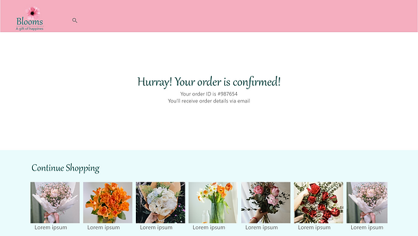
The goal is to design a user friendly experience, let user buy bouquets online within minutes, picking options such as home delivery, schedule a delivery and pick up as per convenience.
My Role and Responsibilities
UX Designer
UX Research
Visual Design
User Testing
-
Conducted competitive analysis by trying competitor apps
-
Conducted user interviews as primary research with 5 users who buy bouquets frequently online and offline.
-
Created user personas
-
Created user journey maps
-
Created paper and digital wireframes
-
Created mockup and responsive design in Adobe XD
-
Created low and high fidelity prototype in Adobe XD
-
Conducted usability study and interview
Understanding the user
User Research

I conducted interviews to generate user insights for this project. I wanted to understand what are the challenges users face while buying bouquets at a bouquet shop, what they liked about the process, how would they like shopping them online and what all the requirements would they be having. I wanted to understand the frustrations and pain points they faced while using other similar apps and websites.
User Research: Pain Points
1
Flower availability
Users could not pre book the bouquets and buy it on the special day they were planning for because of the availability of flowers varies every day at florist shop
2
Visiting the florist
It is frustrating to travel all the way to the florist shop and not getting what you are looking for
3
Missing flowers info
Users found it difficult to get the recommendations appropriate to occasion while buying bouquets at the florist shops
Based on the user's goals and needs, I used the user personas to represent the key behaviors of the audience.

Persona
User Journey Map
The goal was to buy flowers from a new city and identify all the challenges user faced throughout the process

Starting the Design
Story Board
Scenario: An app that allows to preview and choose a bouquet to gift to your family, friends and loved ones.

Site Map
My Goal here was to make a well categorized information architecture for a fluent overall navigation.

Paper Wireframes
Considering the user pain points, better flow of navigation and well spaced arrangements, made four options for the same.
For a responsive website design, I made the final wireframes in three different sizes. A desktop, a tablet and a mobile screen.


Digital Wireframes

Design and Implementation
Sticker Sheet


Takeaways
The website makes user feel handy to use, fulfills their requirements and visually appealing.
One quote from peer feedback:
“The website is aesthetically pleasant, really loved those color schemes.
One important thing I learned here is that the user experience designer’s ideas about creating the designs are not always coinciding with the users reactions or feedbacks.